

Crafting Engaging Dashboard Designs: A Journey into User-Centric Interface Creation
The Art of Dashboard Design
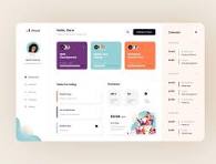
Dashboard design is a crucial aspect of user interface development, particularly in the realm of data visualization and analytics. A well-designed dashboard not only presents information in a clear and concise manner but also enhances user experience and decision-making.
Key Principles
Effective dashboard design follows several key principles:
- Data Relevance: Display only the most relevant data that aligns with the user’s goals and needs.
- Visual Hierarchy: Use visual cues such as colour, size, and placement to guide users’ attention to important information.
- Consistency: Maintain consistency in design elements such as fonts, colours, and layout to create a cohesive visual identity.
- User-Friendly Navigation: Ensure intuitive navigation controls that allow users to interact with the dashboard seamlessly.
- Responsive Design: Optimize the dashboard for various devices and screen sizes to provide a consistent experience across platforms.
Best Practices
Incorporating best practices can elevate dashboard design to new heights:
- Data Visualization Techniques: Utilize charts, graphs, and infographics to present complex data in an easily digestible format.
- Whitespace Utilization: Use whitespace strategically to improve readability and create a sense of visual balance.
- Actionable Insights: Provide actionable insights through interactive elements that allow users to explore data further.
- User Testing: Conduct usability testing to gather feedback and refine the dashboard design based on user behaviour.
- Data Security: Implement robust security measures to protect sensitive information displayed on the dashboard.
Innovation in Dashboard Design
The field of dashboard design continues to evolve with advancements in technology such as artificial intelligence and machine learning. These technologies enable predictive analytics, personalised recommendations, and real-time data updates, enhancing the overall user experience.
In conclusion, dashboard design plays a pivotal role in transforming raw data into actionable insights. By adhering to key principles, incorporating best practices, and embracing innovation, designers can create visually appealing and highly functional dashboards that empower users to make informed decisions with confidence.
Essential FAQs on Dashboard Design: Principles, Importance, and Best Practices
- What is dashboard design?
- Why is dashboard design important?
- What are the key principles of effective dashboard design?
- How can visual hierarchy enhance dashboard design?
- What are the best practices for creating user-friendly dashboards?
- How can data visualization techniques improve dashboard design?
- What role does responsive design play in modern dashboard development?
What is dashboard design?
Dashboard design refers to the strategic process of creating visual interfaces that display key data, metrics, and insights in a clear and intuitive manner. A well-designed dashboard serves as a central hub where users can access and interpret information efficiently, enabling them to make informed decisions quickly. By incorporating elements of data visualization, user experience design, and information architecture, dashboard design aims to streamline complex datasets into visually engaging displays that facilitate understanding and drive actionable outcomes.
Why is dashboard design important?
Effective dashboard design is crucial for several reasons. A well-designed dashboard serves as a visual representation of complex data, enabling users to quickly grasp insights and make informed decisions. By presenting information in a clear and intuitive manner, dashboard design enhances user experience, increases productivity, and facilitates data-driven decision-making. Moreover, a thoughtfully crafted dashboard can improve communication within an organisation by providing stakeholders with a common platform to access and interpret key metrics. In essence, the importance of dashboard design lies in its ability to transform raw data into actionable insights that drive business success.
What are the key principles of effective dashboard design?
When considering the key principles of effective dashboard design, it is essential to focus on elements that enhance user experience and facilitate data interpretation. Key principles include displaying only relevant data aligned with user goals, establishing a clear visual hierarchy using cues like colour and size, maintaining consistency in design elements for a cohesive look, providing intuitive navigation controls for seamless interaction, and optimizing responsiveness across devices. By adhering to these principles, designers can create dashboards that not only present information clearly but also empower users to make informed decisions efficiently.
How can visual hierarchy enhance dashboard design?
Visual hierarchy plays a crucial role in enhancing dashboard design by guiding users’ attention to key information and creating a sense of order and importance within the layout. By strategically using visual elements such as colour, size, contrast, and placement, designers can prioritise data points, metrics, and insights effectively. This hierarchy helps users navigate the dashboard with ease, quickly identify critical data points, and understand the relationships between different elements. Ultimately, a well-executed visual hierarchy ensures that users can interpret and interact with the dashboard efficiently, leading to improved decision-making and overall user experience.
What are the best practices for creating user-friendly dashboards?
When it comes to creating user-friendly dashboards, adhering to best practices is essential for ensuring a seamless and intuitive user experience. Key considerations include data relevance, visual hierarchy, consistency in design elements, user-friendly navigation controls, and responsive design for various devices. By incorporating data visualization techniques, utilizing whitespace effectively, providing actionable insights through interactive elements, conducting user testing for feedback, and implementing robust data security measures, designers can elevate dashboard design to new heights. Embracing innovation in technologies such as artificial intelligence and machine learning further enhances the potential for creating engaging and informative user-friendly dashboards that empower users to make informed decisions with ease.
How can data visualization techniques improve dashboard design?
Data visualization techniques play a crucial role in enhancing dashboard design by transforming complex data into easily understandable and visually engaging representations. By utilising charts, graphs, and infographics, designers can present information in a clear and concise manner, allowing users to quickly grasp key insights and trends. Visual elements not only aid in data comprehension but also help in guiding users’ attention to important details through colour coding, size variation, and placement. Effective data visualization techniques not only improve the aesthetic appeal of dashboards but also enable users to extract actionable insights efficiently, ultimately enhancing the overall user experience and decision-making process.
What role does responsive design play in modern dashboard development?
Responsive design plays a crucial role in modern dashboard development by ensuring that dashboards are optimised for various devices and screen sizes. With the increasing use of smartphones, tablets, and laptops to access data on the go, responsive design allows dashboards to adapt seamlessly to different screen resolutions, orientations, and interaction methods. This flexibility not only enhances user experience by providing consistent functionality across devices but also improves accessibility and usability. By prioritising responsive design in dashboard development, designers can cater to a wider audience and deliver a more engaging and effective data visualisation experience.